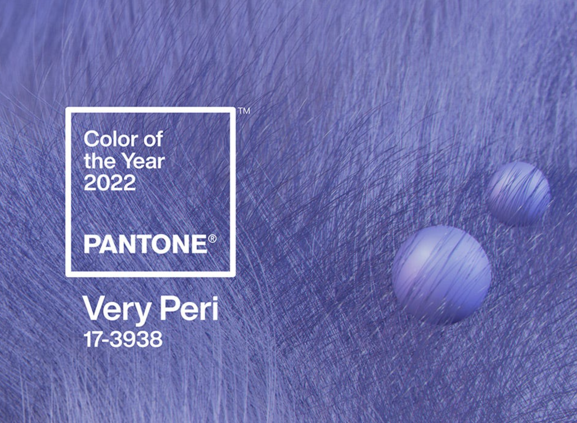
Inject a little colour into your life and your custom home! The brand new colour from Pantone for 2022 – Very Peri!
Tone, light, shade, and colour all have a significant effect on our mood and state of mind. In a custom home, chances are, when you choose to decorate colour is probably one of the first choices you make. For your walls, your trim, your furnishings and decor, and even your floors, it’s simply innate that we look to colour first to transform our spaces.
Colour in our homes is a means of communication. Think of it as speaking through interior design. And, much like music, it’s a way to communicate that transcends language. Think about this: consider the power of nature. Colour, tone, value, light, and shade – it surrounds us. Always.
So, it makes sense that when it comes to the interior design of our homes, colour scheme tops the list of choices we make to create spaces that are uniquely ours; that reflect who we are. Colour is one of the most important components of custom home interior design.
Colour – one of the easiest ways to refresh
Want to refresh and rejuvenate a space? One of the fastest, easiest, and most individual ways to do it is with a coat of new paint. A fresh new colour to inject a sense of vitality and energy or foster relaxation and tranquillity – it’s your choice! – into any room.
The beauty of colour is that it’s entirely up to you! Paint can completely transform the ambience and atmosphere of the space while reflecting your personality and unique style.
Every tone and shade of colour has an effect on our mood. It has an influence on our state of mind. Colour, even white or grey, has the power to stimulate a feeling. That’s why it’s important to give the colours you choose a lot of thought.
How do you want to feel within the walls of the rooms of your home – calm, concentration, high-energy, comfort, drama? The colours you choose should help you achieve that.
Panatone Very Peri – carefree, creative and a need for transition
After two years of pandemic and so much more time spent in our homes, it should come as no surprise that a company such as Pantone would want our collective feelings to reflect in their colour of the year.
This year, many design trends and colour experts are calling for colours that foster tranquillity, comfort, and calm, which, by the way, we also love – nature-inspired hues that are warm, soft, and typically green. And yet, Pantone, the company that originated the Color of the Year, has chosen a different path.
Rather than choosing from its existing spectrum of colour, for 2022, the company has created a completely original colour: Very Peri (17-3938). So very novel – and SO purple! – it’s a vibrant shade of periwinkle blue with a dynamic violet and red undertone. Pantone describes it as “displaying a carefree confidence and a daring curiosity that animates our creative spirit… a symbol of the global zeitgeist of the moment and the transition we are going through.”
Futuristic, promoting creativity and innovation, Very Peri combines the reliability and constancy of blue with the excitement and vibrancy of red. It seems appropriate to help inject some energy into our days, even if you choose it as an arresting decorative accent rather than an immersive experience throughout the entire space.
The first Pantone Color of the Year was 2000’s Cerulean blue – the colour of “the new millennium”. The annual selection is a fun way to look at colour, to explore our own attitudes and feelings about colour and how it influences our lives.
With springtime almost upon us, chances are you’re looking around your own spaces to see what needs sprucing up. We’re there with you! Our first stop? Colour! We may not be jumping in with Very Peri, but we’ll be exploring how we want to enjoy our spaces and if the current colour scheme is helping us to do just that.
Happy painting!


